
I've got ADD and lots and lots of mineral makeup. Oh, the fun I shall have!
EoTD: Never Refuse a Fifth
Posted on Friday, at • 515 views
Please pardon the gaps...
The site is in mid-migration now (manual migration of over 7,000 entries, so there's a lot to be done.) The entry stubs are created for older content, but for the most part, the actual content isn't there quite yet. I am working on it. Unfortunately I have no ETA. But feel free to link to any page! When the content does get populated, the URL will stay the same.

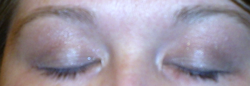
This entire kit - an actual whole kit, with everything but foundation and mascara - also included a very nice, specific tip sheet for applying all of the eye colors. It looked fairly good. I think I need to spend some time figuring out why each color went where it did, so that I can competently put together other looks based off this same template.
Face
- Sephora Light Touch Concealer
- Meow Cosmetics Sleek Himalayan foundation
- TSS' Movin' On Up blush
Eyes
- Benefit Cosmetics' Recess creaseless cream shadow, lash to brow
- TSS' Pearls and Stilettos, inner eye top and bottom close to tear duct
- TSS' Cocktails on the Terrace, inner eye to center of lid lash to orbital bone
- TSS' Uptown Attitude, central crease towards outer iris ring
- TSS' Divas on Fifth, outer lid / outer edge of crease
- TSS' Snooty Socialite, upper and lower outer half of lash line
- TSS' Park Avenue Princess, browbone
- Tarte Lash Hugger mascara, upper and lower lashes
Lips
- TSS' Little Miss Luxe lip balm
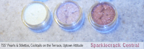


I was pleased with Pearls and Stilettos. It was a soft lightening / brightening effect without looking too artless or obvious. That's been my main reason for not doing looks with color right near the crease: I don't like the way it looks on most people, so hadn't even tried it on myself, not even with supersoft colors.
Uptown Attitude is a gorgeous reddish plum brown. The photos on TSS' site made it look more red than it actually is. (By contrast, my photos make it look almost washed out. Part of that is my pitiful picturetaking skills...and part of it is the fact that the color is NOT as saturated a red as one might believe from the TSS site photos.)
Cocktails on the Terrace is a lovely ice-sheer lavender pearl. I'm glad I got a few kits, because I think this color is going to get a workout.
The lip balm is a nice, neutral color. A soft mauve-red. Again, the TSS site photos don't accurately transmit this color. There, it looks quite red. In the tube, it looks like a soft mauve-nude. On the lips...soft neutral mauve-nude with barely any shimmer.
Like this entry? Check these out:
or look at other entries tagged with


 Share This Page
Comments
Commenting is not available in this channel entry.Categories
We're Everywhere
Disclaimers and Such
 Sparklecrack Central is my personal site. I buy all the items myself. I do not receive any compensation for the posts I make. I also don't post "guest content." All makeup company names, kit names, and color names are trademarks of their respective owners. All original site content, including photos, is free for non-commercial re-use with attribution (further details).
Site Information
Copyright © 2026 Sparklecrack Central - Some Rights Reserved
Responsive design that actually works in IE8. Yes, really. (...get a real browser...)