
Sparkly like a Mormon vampire.
Site gripe of the week: Tchotchke-vomit
Posted on Thursday, at • • 568 views
If you follow me on Twitter, or if you've read my infrequent rants, you'll know that I occasionally talk about ‘usability'. In simplest terms, usability refers to how easy something is for users to use without having to read the manual, or a site map. I first heard the term in the professional web design world, but it applies to just about anything: web sites, software, computers, home theater systems, cars…you name it. One of the basic tenets of web usability is: the web is not a medium where the designer is in control. The user is. The user can view the site through any number of browsers, any number of devices, at any resolution or browser size; and a good design will be as easy to use on an old black-and-white 13” monitor with 640x480 resolution as on a HD 1080pi 27” monitor at 1280x1120 resolution. Now that the internet is more than ten years old, most people who create web sites know not to have cyan text on a white background, or have music or video that blasts from the speakers the instant anyone lands on your site. But having a layout that's clean, easy to read, and balanced between content and whitespace is just as important as avoiding “newbie” design mis-steps.
When you decide to place ads on your blog, stop and think about how many ads you want to have, and how large they'll be. Then, test your site with no ad- or content-blocking software whatsoever. Make sure that your ads aren't the first thing people notice when they come to your site. When people visit your site, your content should be what draws them in, and what they continue to read and remember…not the ads. Your ads will make money if they tread that fine line between “attracting attention” without crossing over into “hard sell”. Your ads should make sense, should be products that you'd actually recommend…and the ads should not be the most noticeable thing about your site. If your ads tip over into the “hard sell” zone, you'll drive readers away. Or they'll just block all your ad content (even projectwonderful and passionfruitads) because - trust me - we're utterly sick unto death of being hard-sold everywhere we go: online newspapers, malls, . More than five ads on a page, and your layout is dangerously close to “carny barker” territory…if it isn't there already. Popups and overlays can be useful, but they should be used carefully. If they're generated by something the user does, that's one thing. If they open up when the user lands on your page, that's perceived as “getting in the user's way.” Don't annoy your users, or they won't come back. (And then how will you make any money off of those ads?)
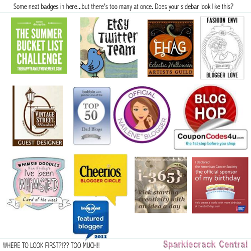
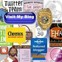
It's much the same with blog badges. It's wonderful that you're a part of Chartreuse network or Purple group or Green association; that you've won awards 1, and 2, and C; and that you want to display badges for the one or two dozen other blogs that you really enjoy. But find a way to share that all with your readers, not shove it up their noses. If you're on a CMS (such as WordPress), use a randomizer plugin to display a different badge or three every time someone loads a page on your site. That will let you share links to blogs you like, groups your associated with, or awards you've won…without drowning out your content. If you don't have a way to display random text and images, think about putting all your blog badges on a “blogroll” page, all your association and awards badges on the About page. It displays the links and badges in a way that's very easy for visitors to find, but it doesn't make them the primary or even secondary focus of the page. For the various awards, and achievement badges, you can highlight those in a post about the award or association itself, as well as listing them all on a separate page. That post not only brings it to peoples' attention and gets you extra SEO, but it lets you display your badge without overloading people on every single page they visit.
There's not a hard and fast rule about how many buttons, badges, or icons you should display; but based on my personal experience, I would say that more than five badges or ads per page is fairly comfortable, ten is getting a bit crowded, and five badges per page area - sidebar, header, footer - is too many. Unless they're no larger than those tiny little badges that were so scathingly popular in the early 00s. (For those counting, this gives you fifteen pieces of flair per page. That's too many, even at Chotchkie's.)
Whenever you add something to your page layout, think about why you're adding it. Is it for SEO? Is it to make money? Is it sharing your favorite sites with other people? Is it to get a link back to your site? Whatever the reason, your blog's primary reason for existence is to display your content so that your visitors are able to read it - and hopefully enjoy it. Your site design shouldn't look like a freeway at rush hour, or an amusement park on a holiday weekend. Ads and badges and widgets should complement your content, and should somehow appeal to your readers. They shouldn't get in their way.
Was this interesting? Add to my Klout score on usability and web design.
Like this entry? Check these out:
or look at other entries tagged with


 Share This Page

Comments
Commenting is not available in this channel entry.Categories
We're Everywhere
Disclaimers and Such
 Sparklecrack Central is my personal site. I buy all the items myself. I do not receive any compensation for the posts I make. I also don't post "guest content." All makeup company names, kit names, and color names are trademarks of their respective owners. All original site content, including photos, is free for non-commercial re-use with attribution (further details).
Site Information
Copyright © 2026 Sparklecrack Central - Some Rights Reserved
Responsive design that actually works in IE8. Yes, really. (...get a real browser...)